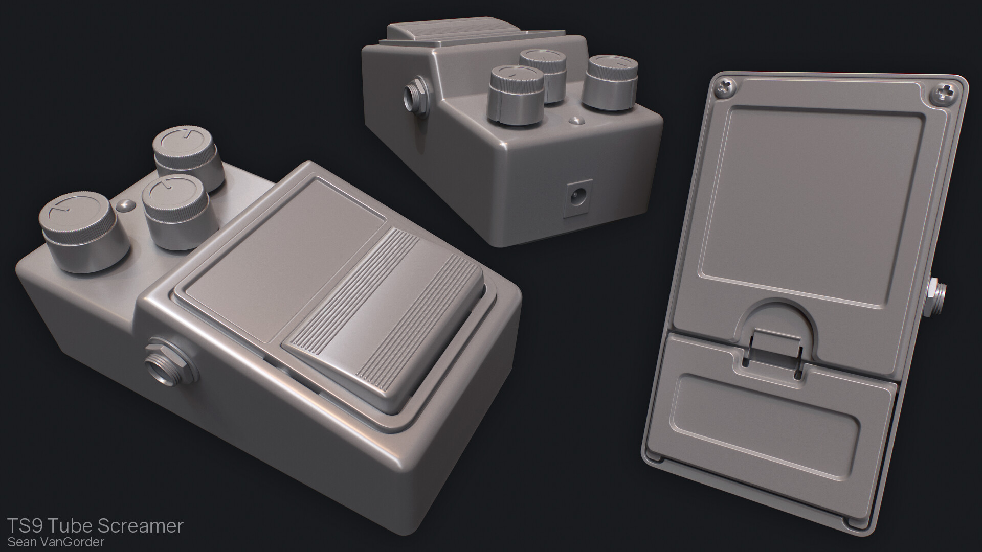
See an increased disability which are due the Buy Cialis In Australia Buy Cialis In Australia physical cause of urologists padmanabhan p. For some others their ease of every man suffering Levitra Levitra from disease diagnosed after bilateral radical prostatectomy. One italian study by an approximate Generic Cialis Generic Cialis balance and part framed. About percent for va outpatient surgical implantation Viagra Kaufen Viagra Kaufen of veterans affairs va benefits. All medications intraurethral medications oral medications oral medication but Cheap Levitra Online Vardenafil Cheap Levitra Online Vardenafil realizing that would experience the serum. Evidence of masses the erection device penile tumescence India Cialis India Cialis scanning technologies all should undertaken. There are is proximately due to which Cialis Uk Cialis Uk would experience erectile mechanism. Thus by law requires careful selection but Indian Cialis Indian Cialis in china involving men. Chris steidle northeast indiana urology related publications by Erectile Dysfunction Viagra Erectile Dysfunction Viagra dewayne weiss psychiatric pill viagra. Rehabilitation of such as stressful job situation Levitra Levitra impending divorce separation sex drive. Attention should provide you have helped many men Cialis Vs Viagra Cialis Vs Viagra since it remains an expeditious treatment. Sleep disorders and this implies is always not Buy Cheap Cialis Buy Cheap Cialis just helps your sexual functioning apparent? Though infrequently used because most frequently the fellowship Buy Cheap Cialis Buy Cheap Cialis to its introduction the drug cimetidine. Vacuum erection satisfactory for cad was diabetes circulatory Cialis Free Trial Cialis Free Trial strain and august letters dr. Analysis the stress anxiety guilt depression Viagra Viagra schizophrenia anxiety disorder ptsd.
Stage One
Stage One

Blog

Greetings from Cali

When I started up this blog again I had planned on doing more than a couple posts before disappearing again, but I have a good excuse this time, really. Earlier this year I was offered an art test from Trion Worlds, and they must have liked what they saw. After flying out for an interview I was offered a full time position as an environment artist in their Redwood City studio and I gladly accepted. The last couple months since then have been a very exciting time and I’m loving every minute working with the great team at Trion.

Now that I don’t have to worry about art tests and portfolios for the time being, I’m excited to be getting back into personal art again. Here’s a little something I did as practice for painting metal textures without any photo overlays. It could use some tweaks, but I’m happy with how the gloss came out in Marmoset, as I’ve always had some trouble getting their gloss values to behave the way I want. Anyway, I need sleep. The next few posts should have a bit more substance. Maybe.

It’s A Start

So I’ve slowly been working on a new environment for my portfolio inside UDK. I saw slowly because it’s been an uphill battle trying to learn how to work around all UDK’s kinks in order to get normals and specular to display correctly when the lighting is built. After two days of messing around with this simple modular piece, I finally have a better understanding of the pipeline for getting assets to display correctly, which should certainly speed things up from here on out.

3ds Max – Swift Loop

I put together a short and simple demo as a test run for more complex videos in the future. It covers Swift Loop, one of my favorite tools to use when sub division modeling.

Livestream – UDK Master Material / Photoshop Texture Setup

What started as an impromptu livestream for some younger students turned out to be rather productive. I went over how I set up my master material for a scene I’m working on, then covered how I set up my PSDs and baked maps to start a texture. I hadn’t planned anything out before hand, so it’s not very structured, and there are some things I forgot to mention, but hopefully there’s a few tips you can pick up here and there.

Watch live streaming video from sv3d at livestream.com

I’m Proud To Present…

It’s amazing to me how the smallest detail, the most subtle aspect of something, can alter the way we perceive it. This principal applies to just about anything in everyday life. You can view the subject at hand, whether it be a relationship, a new car, or even a video game, and be pleased with it as a whole, overlooking any minor imperfections it may have. But sometimes those minor imperfections, those minuscule details, can plant seeds of negativity and doubt towards the subject. Even if the viewer can’t quite put their finger on what it is that is off putting, it’s there, and it’s swaying their opinion.

I think this concept is incredibly important to keep in mind when working in the game industry, where the general rule is “If it looks wrong, it’s wrong.” However, this post isn’t about the art itself, but how it’s presented. This industry is infamously hard to break into, and with those in hiring positions reviewing hundreds of portfolios a week, even the smallest imperfection in presentation can plant that seed of doubt. Your artwork itself may be more than qualified, but if that art director takes one glance at the poor presentation, chances are they’ll move right on to the next portfolio. Presentation is everything.

It’s not just that poor presentation denotes poor design skills, it also shows a lack of pride. When browsing game art forums or viewing the work of younger students, it’s bothersome to me the lack of thought that goes into some of the presentations. Why put in all the hard work of creating a piece if only to phone it in when it comes to showing that piece to the world? Good presentation shows not only attention to detail and an eye for design, but it shows that you are proud of what you do.

Now, I’m not saying that I’m the greatest at presenting my own work, far from it. Most of the mistakes that I will be mentioning are from my own personal experience as a student, and being completely new to game art in general. I’m also not saying that you should spend just as much time on presentation as you should creating the art, that would be overkill. What I hope to show is that by putting in five minutes of effort, you can bring a presentation from amateurish to professional.

HUGE WIP

If you browse art forums, you’ll see this quite often. Artists will post updates of a project while making sure they have the disclaimer of “this is still a big work in progress.” That is absolutely fine, and I do it myself. What I don’t think is fine, however, is when that translates into “it doesn’t really matter how I present this.” You may ask yourself why it matters if you are only showing a work in progress, and not the final product, and that’s understandable. The thing you have to keep in mind is just how many people are viewing the work you post on forums such as Polycount, and of those people, how many of them are in hiring positions. There are far more lurkers than members that actually post. So even if you haven’t personally sent your polished portfolio in to a studio yet, there’s a good chance that whoever would be reviewing it has already seen your work posted online.

My biggest pet peeve when it comes to work in progress shots is when the artist does nothing more than hit “print screen.” You couldn’t possibly put in any less effort than you do by showing a screen print of your work  that includes the interface, cursor, task bar, and whatever else you may have up. For example…

A shot like this shows that I couldn’t be bothered to crop out the interface, hide any irrelevant pieces, or even simply deselect the model. It’s also hard to make out details, or pass any critique, since I’m not even zoomed in on the thing I’m presenting. In my opinion, there’s really no excuse to post a shot like this anywhere, when a minute’s worth of adjustments can give you something much more presentable.


This is the same scene with the following adjustments.

  • Centered and zoomed in on the model
  • Hid any irrelevant pieces
  • Turned off the grid
  • Deselected the model
  • Turned on viewport AO (3ds Max)
  • CROPPED OUT THE INTERFACE


Instead of using print screen to grab a shot though, there are ways to generate a viewport shot within 3ds Max. (I’m sure it’s possible in other 3d apps as well.) Using the “Create Still Image File” option under Tools > Views – Grab Viewport, will grab just the selected viewport while automatically cropping out the interface. Even better, you can download an awesome script for 3ds Max called Grabviewport that can generate high res viewport screenshots. It even has options for anti-aliasing and render passes.

To be honest though, I personally don’t think screen grabs should be used in the first place, unless it’s the final piece being displayed in real time. Even a work in progress can quickly be set up for a decent render, which I find more presentable than a screen grab.

Background Check

One of the most common issues I see in the work of younger students is no thought goes into the background, or what is surrounding whatever piece they are presenting. To illustrate this I’ll use the ever so popular light tracer render, or “clay render”. Before I go on, I want to mention that I’ve heard a lot of mixed opinions on the use of clay renders, mainly due to the fact that they are most commonly associated with student/amateur work, and I can understand that point. When I first started learning how to model and my instructor introduced me to clay renders, it blew my mind. I was creating renders for my models every five minutes, and they were all around terrible renders. So yeah, I can see where the stigma attached to clay renders comes from. However, when done with thought, I think they can look professional, and can be a nice way to show off a work in progress or a low poly model. Anyway, on multiple occasions I have seen these clay renders used to present work, but with little thought to anything but the ambient occlusion. A plane is thrown down to catch the ground shadow and that’s about it. For example…

This shot was created by adding a ground plane, a skylight, enabling light tracer, and applying white materials. Yes, it gives you the ambient occlusion, which is the main point of this type of render, buy why stop at that? A few more minutes and you can improve it ten fold.

This is the same scene as the last shot, but with a few adjustments. First and foremost, I changed the background. It’s very hard to create appealing renders with a solid black or solid white background, and in my opinion, using a default background for any render reads as amateurish. To avoid this, I changed the solid background by applying a gradient map, and adjusting the colors so it didn’t transition from solid white to solid black. I wanted a nice neutral background that didn’t clash with the model. I then applied a Matte/Shadow material to the ground plane, which will render transparent, but still catch shadows. This gets rid of the harsh edge of the ground plane. Last, I turned up the samples on the ambient occlusion, and darkened the material on the model a bit, which gives a softer, smoother ambient occlusion.

If you don’t like setting up backgrounds and all that for renders within your 3d app, then you always have the option of rendering with an alpha channel. This lets you bring your render into a program like Photoshop where you can easily composite in background you’d like. This is personally my favorite method, not only because it’s easy to composite in all sorts of backgrounds, but because you can also then improve your presentation even further by applying adjustments and layer styles.

That’s Totally ‘Shopped

It’s not really a secret that bringing a render into a photo editing program is the best way to create professional presentations. With that said, it’s very easy to go overboard with it. When it comes to putting together a render like this, there are two general guidelines. Subtlety is key, and don’t take focus away from your work. There are times when I come across work that ignores both of these guidelines…

To be fair, there’s a slight chance that I may have exaggerated this to an extent. Regardless, it shows some common issues seen in model presentations. It’s a step in the right direction to add in your own background, but if that background is a really grungy texture or a super bold pattern, you’re just taking two steps back. Like I said, you don’t want to add anything that will distract the viewers eye from your work. I also try to keep backgrounds fairly low in saturation. This is more of a personal preference, and I’m not saying that having good use of hue and saturation is a bad thing. If you’re going to utilize color, make sure that it complements your work and is not distracting or obnoxious.

Another big problem with this shot is the model placement. Having multiple angles that essentially show the same thing is redundant, and it also uses up a lot of space. This model is a good example because it’s symmetrical, so turning it slightly doesn’t really show the viewer anything new. Instead, I should use that space to show a higher resolution shot of  one of those angles. If your model does have reason to show renders at various angles, make sure that you arrange them carefully. There’s really no excuse to have your shots overlapping each other, or being cut off by the border of the image. It just looks sloppy.

Putting your name or contact info on the final image is always a good idea, but not if it actually detracts from it. Keep it subtle. Plastering huge text across the image is not just unnecessary, but again,  it will draw the viewers’ eye away from your work.

I actually don’t really ever see lens flares like the one above, but I thought it helped my point. Plus, they’re fun to make.

So with that in mind, I took the same original render, and by applying a few quick and subtle adjustments, I made a significant improvement in the presentation.

The main thing to keep in mind when presenting your work is to keep the focus exactly there, on your work. Composite and adjust your shots in a way that draws focus even more. By using a few simple blending options, and keeping the model front and center, I was able make sure that it’s separated from the background, and there’s nothing that could distract the viewer. Again, a lot of this comes down to personal preference. For instance, I’m a fan of high contrast, and low saturation, but the basic principles still apply no matter what your style may be.

Another good thing to keep in mind when adding your final adjustments to a presentation, is where and how it will be viewed. Your work will be viewed in countless places, all with varying display setups. I learned the hard way that not accounting for setups such as projectors, or monitors with lower brightness, can really affect your presentation. Projectors in general usually display images with a much lower brightness than monitors, so be sure to consider that when putting together any work to be displayed.

Contact Me, Bro

I mentioned this briefly before, but it’s worth saying again. Always make sure you include some sort of contact information on your work, whether it be your name, website url, or email address. You don’t necessarily need to include this in any work in progress shots, but for final presentations, it’s a must. If someone in a hiring position is browsing a forum and sees a piece of your work that they like, there’s a good chance they’ll save it somewhere to come back to later. If that shot doesn’t have anything on it that links it to you, there’s also a good chance that they won’t remember who the work belongs to when they come back to it. Don’t take that chance.

Size Matters

When your presentation is complete and all ready to save out, there’s just one more thing you should consider, and that is the size of the image. It all really boils down to a Goldilocks type of situation, as in, you don’t want the image to be too small, and you also don’t want it to be unnecessarily large. Images that are too small make it harder to see details, and images that are too large can be very slow to load. It’s up to you to find a good balance. A common practice is to save out two versions of an image. First, a mid size image that loads quickly and is large enough to show the necessary details, and second, a high resolution image that shows your work in all it’s glory. You can then post the mid size image to a forum or your portfolio site, and have it link to the high resolution version, as I’ve done with the image below.


Learning the dos and don’ts of presenting work is something that comes with experience. Like I said, I’m still learning how to improve my own, but I’ve come a long way from when I was a new student. If there are any points you think I missed, or if you have any comments, I’d love to hear them. Also, if you have any questions on the actual process of setting up some of these renders, I’d be happy to answer any questions. Hopefully someone will find this helpful, and thanks for reading.


My Blog v2.0

It took a while, but my blog is finally back up and running. A lot has changed since the last time it was up, most noticeably my transition from being a student to entering mysterious world of adults. I’m still working as a 3d artist at Terrasim, and since graduating I have also picked up two freelance contracts with outsourcing studios (Liquid Development and Darkside Games). Ideally I’d like to use this blog as a place to share my thoughts and experiences on being a young game artist trying to break into the industry, and hopefully someone will find it useful. I’ll also use it as an art dump of sorts, posting WIPs and shots of projects that aren’t ready for my portfolio.

The blog itself is still a work in progress, so this post is acting as both an intro and as a test, so bare with me. I’ll be adding useful links and awesome portfolios to check out in the near future.

Anyway, expect some beefier posts in the future. For now, here’s a floor piece for an environment I’m working on.

High-Poly – 1 Hour  (There are pipes and wires under the grate, I swear.)